Brand Identity + Packaging System for Biiji Equine
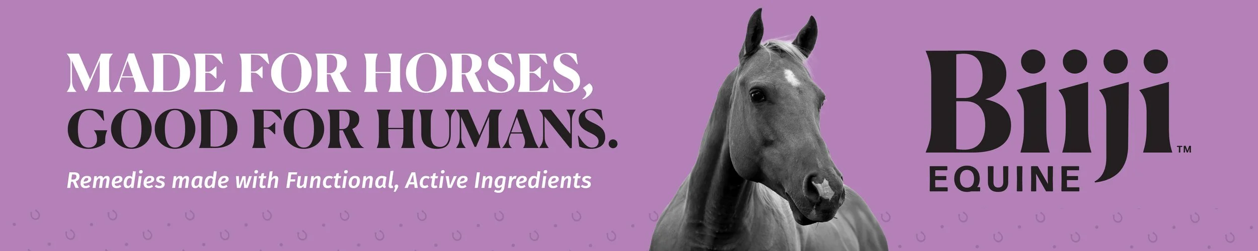
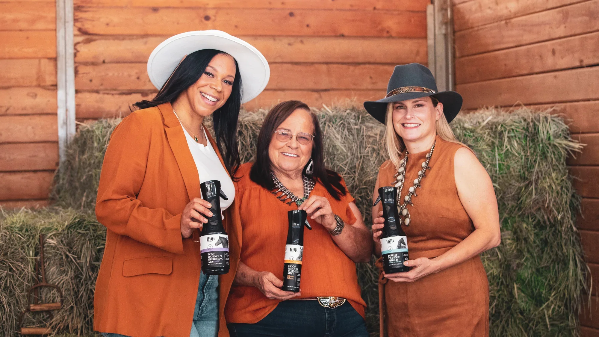
Biiji Equine is a natural equine skincare line designed to feel clean, professional, and elevated within the animal wellness space. I developed the full brand identity and packaging system, creating a sleek visual language that balances performance, simplicity, and premium appeal
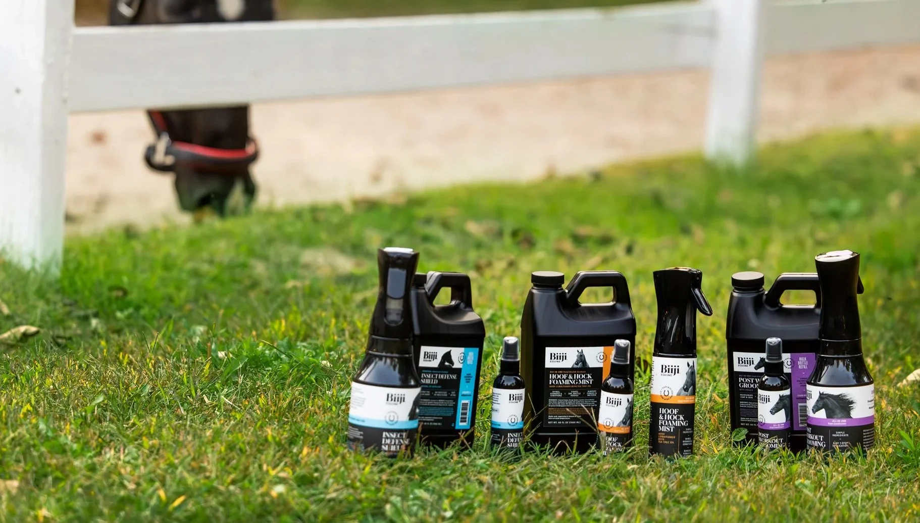
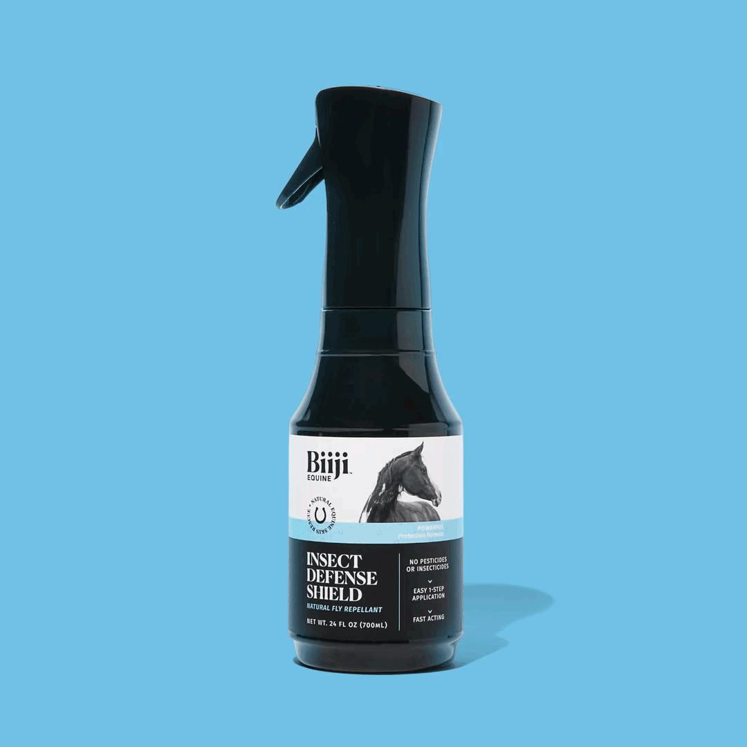
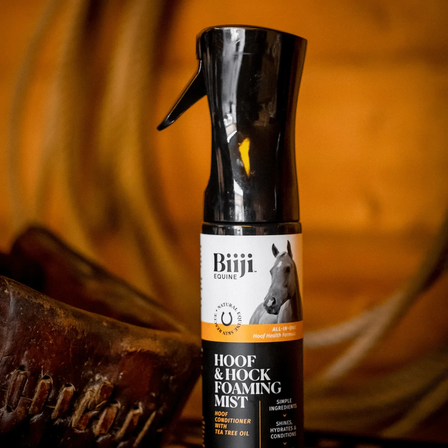
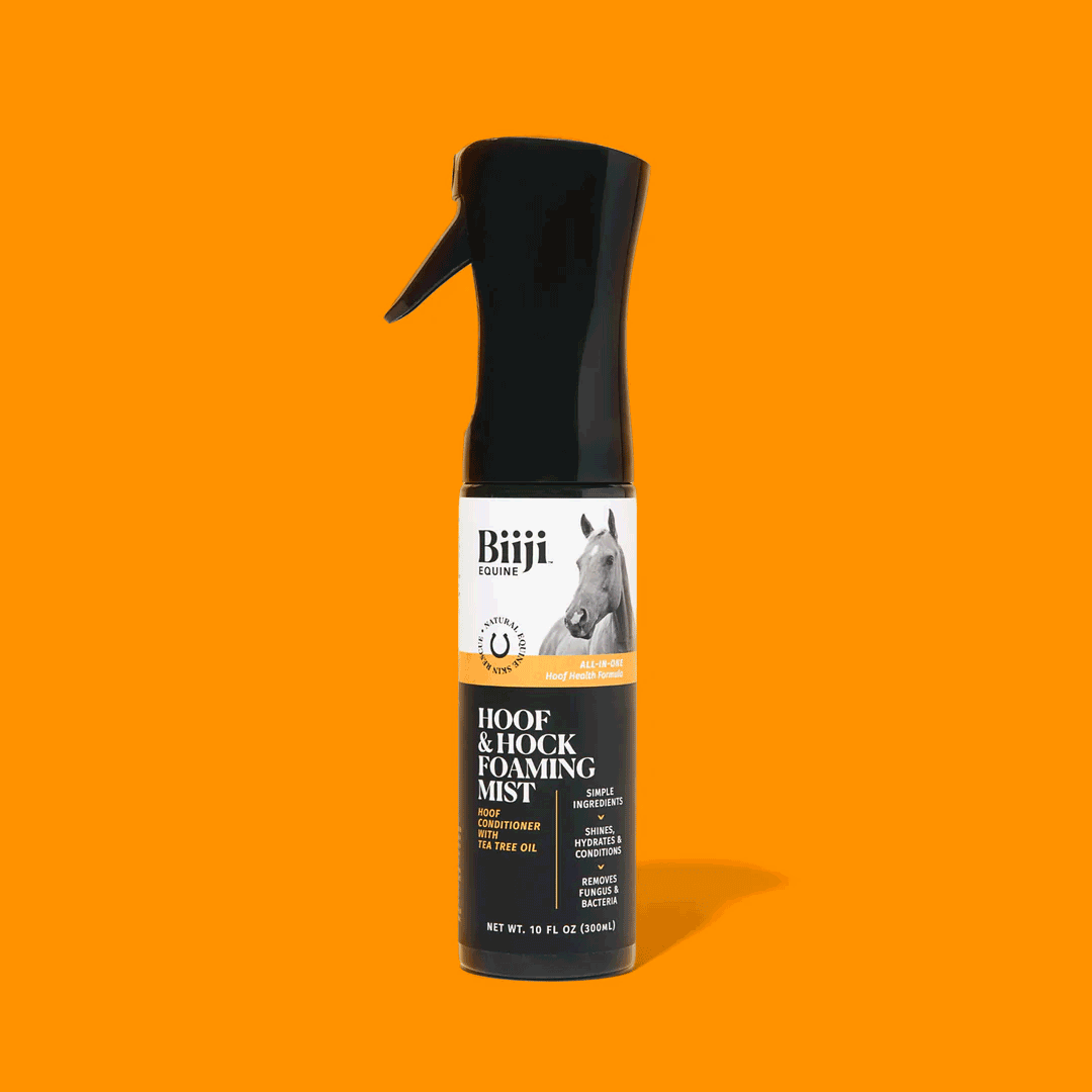
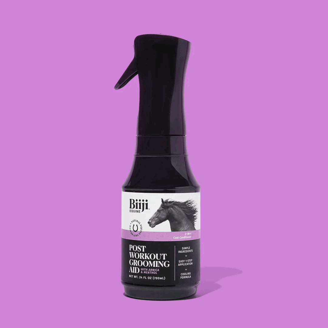
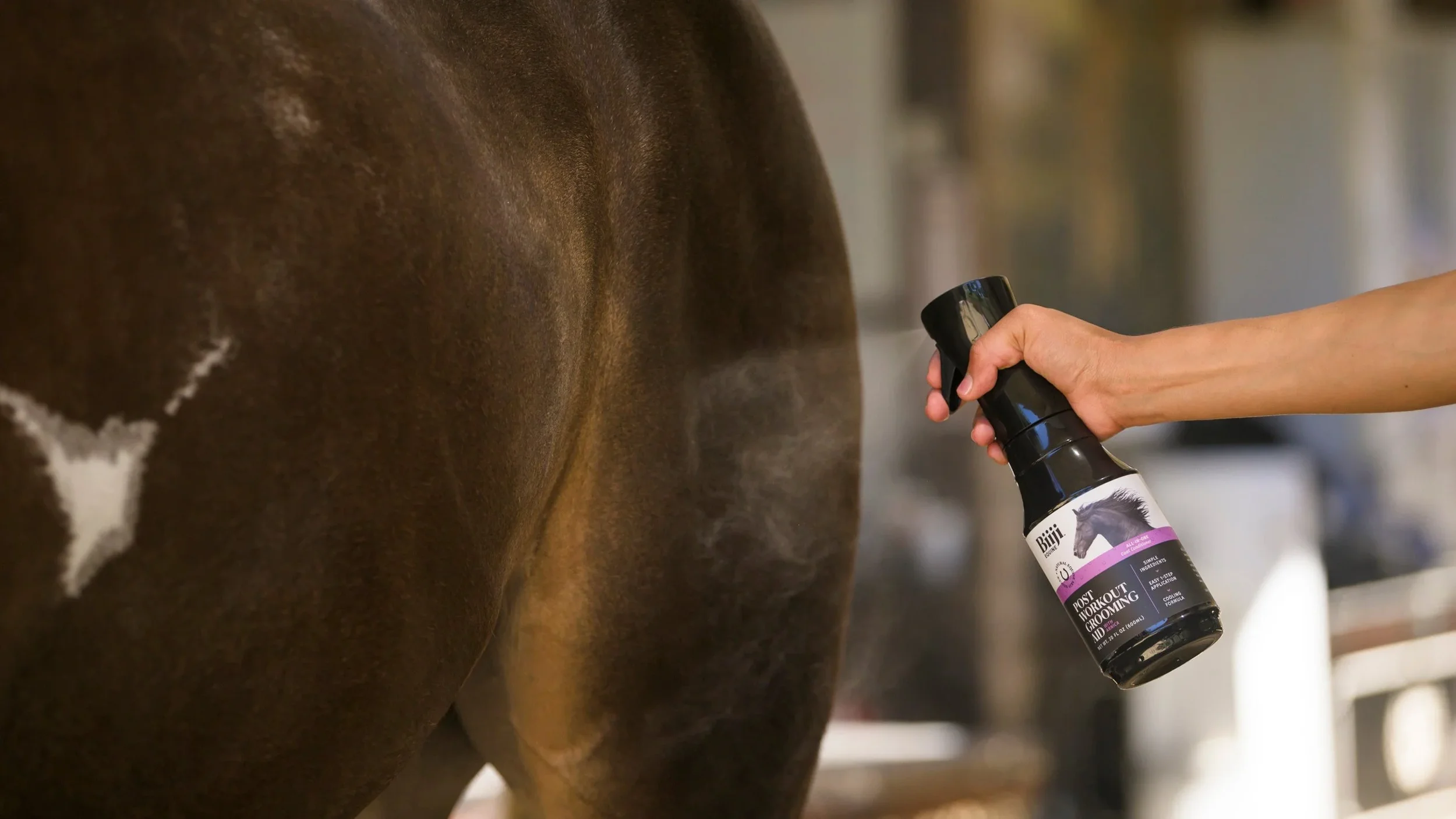
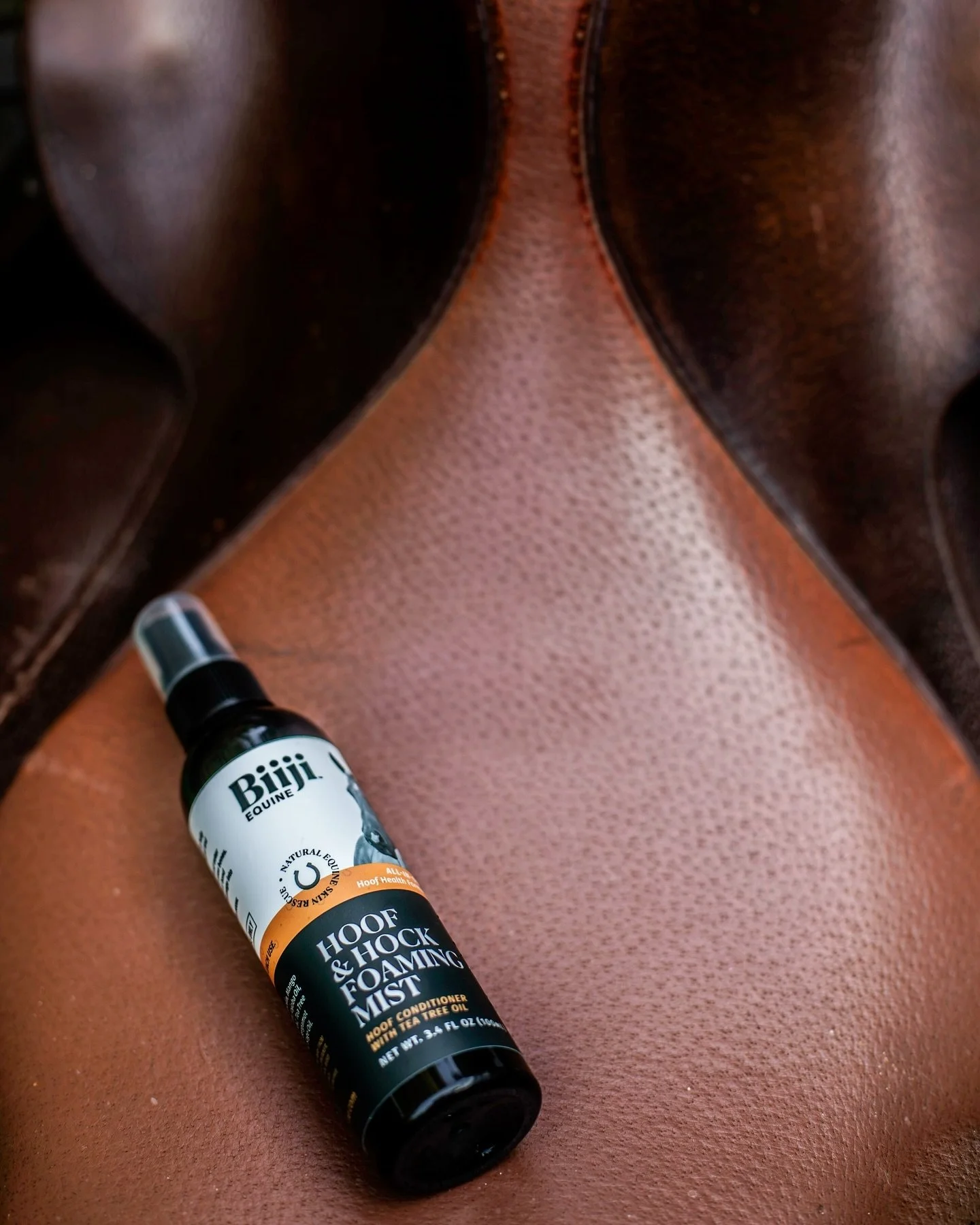
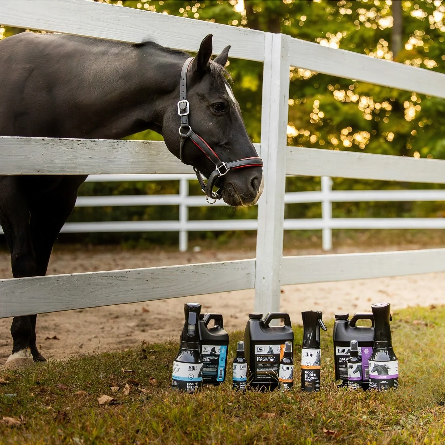
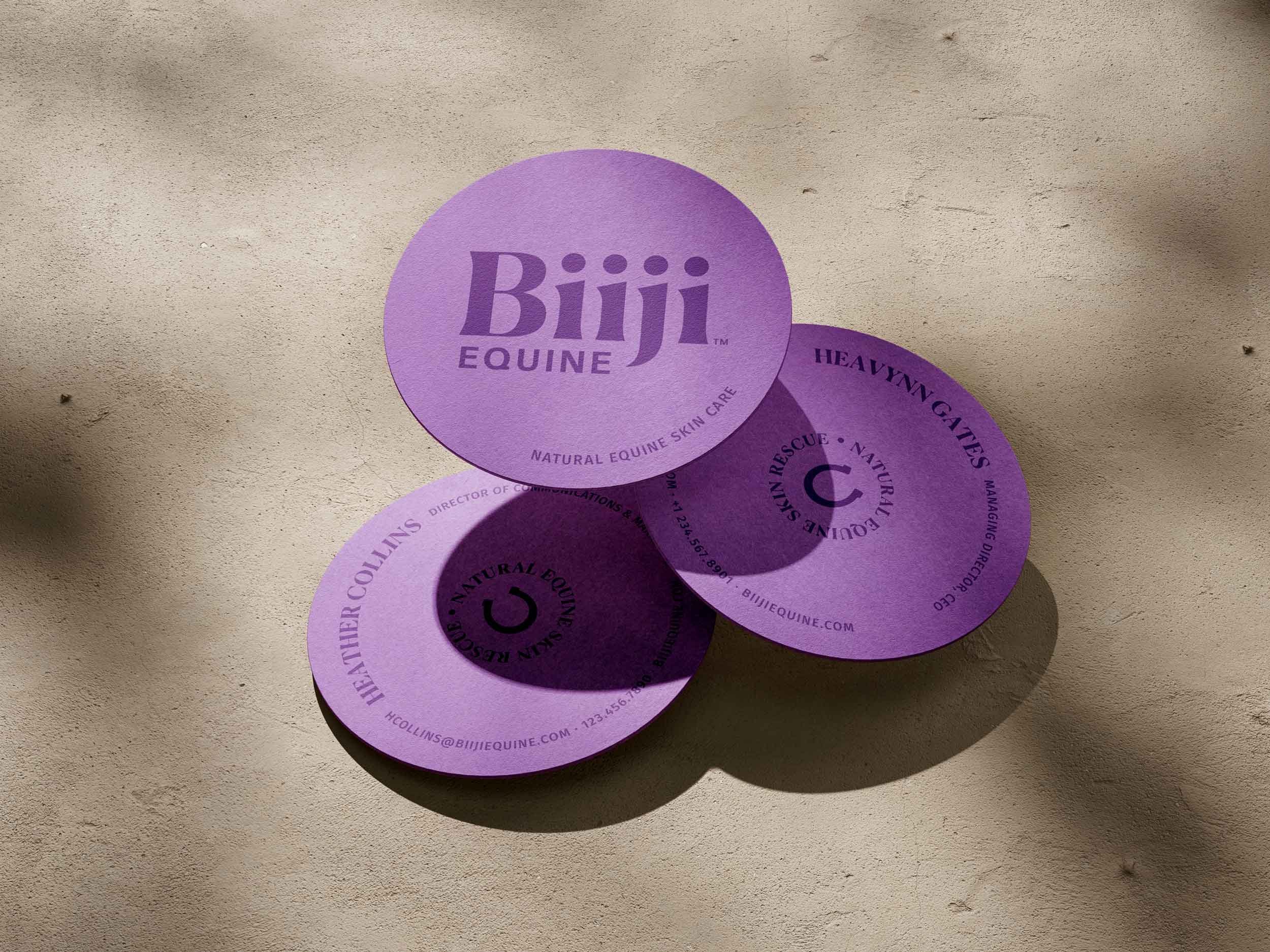
Each product features a distinct black-and-white horse portrait paired with a color-coded band for easy differentiation across the line. The label system was carefully designed to meet regulatory labeling guidelines while maintaining a refined, minimal aesthetic. Subtle brand details, including a custom horseshoe mark and a repeating horseshoe pattern inspired by luxury fashion monograms, reinforce the brand’s elevated positioning.
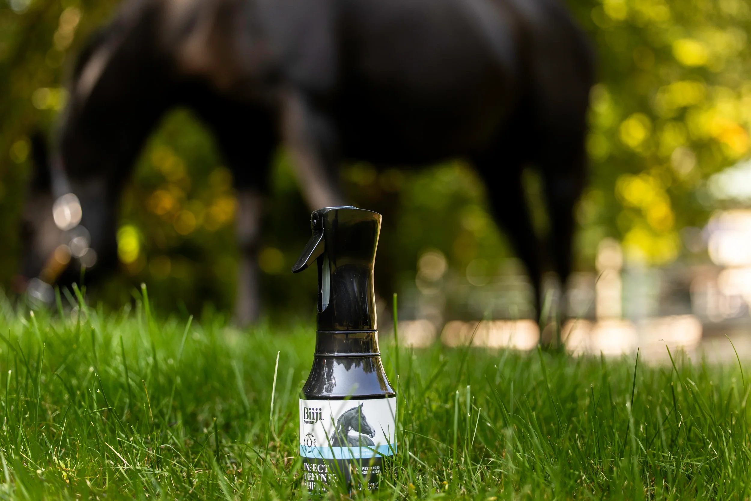
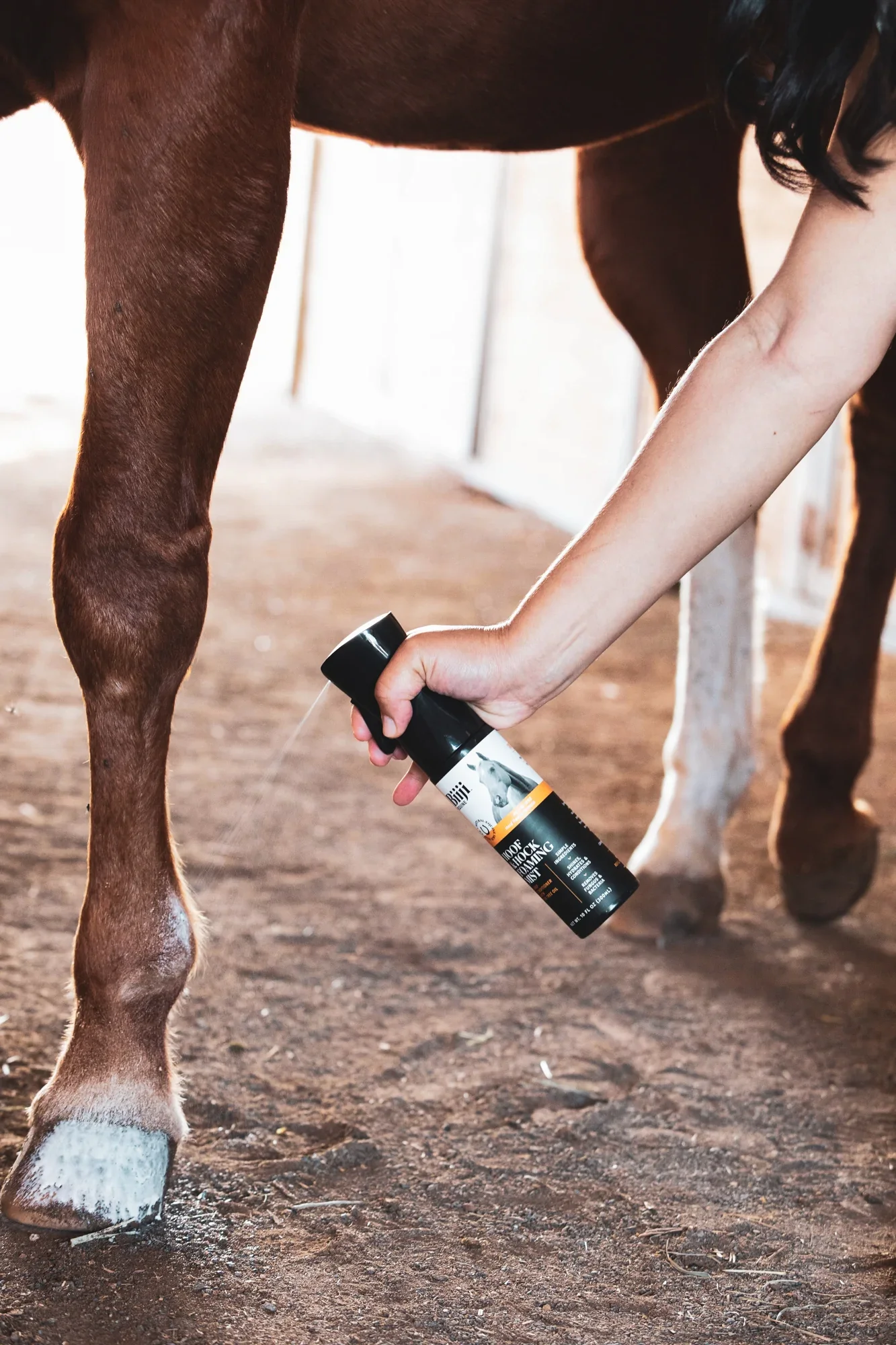
Beyond packaging, I extended the identity across marketing touchpoints, including trade show materials, print collateral, product imagery for web and retail use, and photography direction. The result is a cohesive brand presence that feels modern, trustworthy, and distinctly premium within the equine care market.
Rose Chenoweth, Design
Designed in collaboration with Genghis Kern Letterpress & Design